Supporting left-to-right (e.g. English, Spanish) and right-to-left (e.g. Arabic, Hebrew) languages within the same application may be tricky. First of all, you need to understand how content is actually placed in different languages, what users are used to, and what are the rules of placing elements on the page. Another thing is what needs to be done from the technical side in order to support both directions.
From the bigger perspective, almost all the elements on the page need to be flipped: buttons, images, etc.
English version:
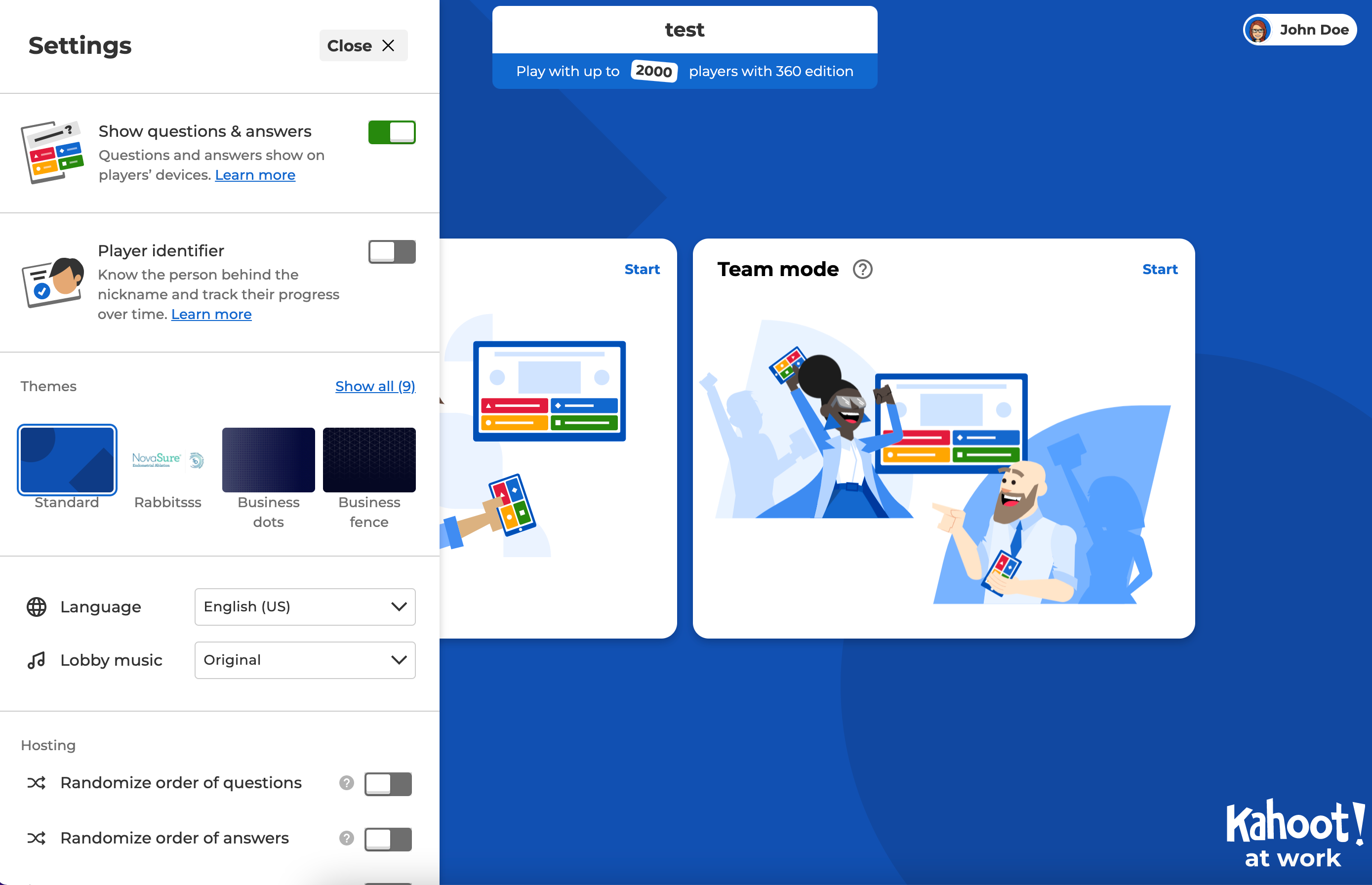
Arabic version:
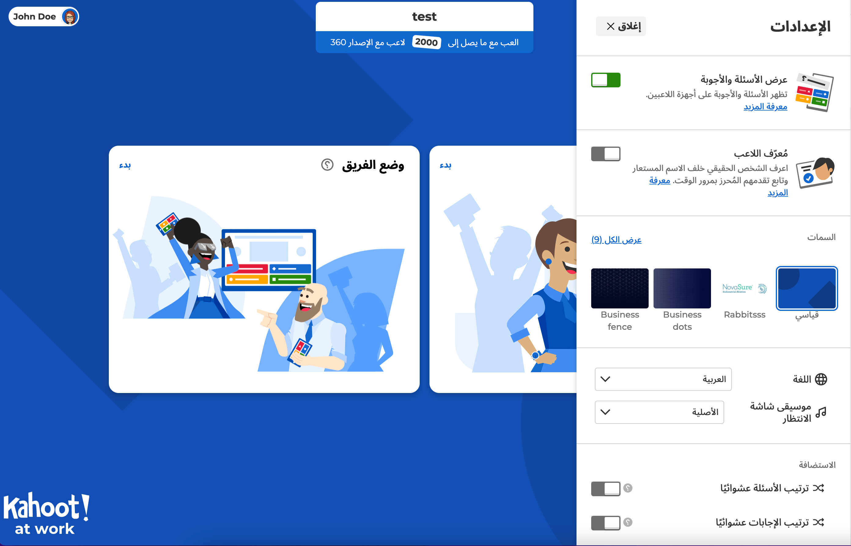
The easiest solution would be creating different pages/components for left-aligned and right-aligned languages. But supporting both versions would be a nightmare to maintain. That’s why we had to find a solution on how to support both options within the same page/component.
The first thing where you need to start if you want to introduce right-to-left (RTL) on your platform is adding the dir attribute to <html /> tag – <html dir="ltr">...</html>
dir=”ltr” will set all the content on the page left-to-right oriented. As the opposite, dir="rtl" will set everything right-to-left oriented. While switching between languages on the page, you need to check whether the chosen language is left-oriented or right-oriented and set the corresponding value to the dir attribute. Only by adding the dir attribute, you will notice how much work HTML does for us.
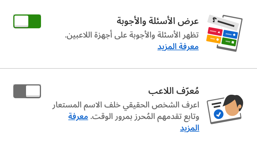
But what if in some cases you don’t want the elements to flip after you switch to RTL language? For example, in the Quiz question type, we have a standard placement of the colors: red – blue on top and yellow – green on the bottom.

If we apply dir="rtl", we will end up with switched answers and colors:

This can be problematic for the players if the language on the screen (host) is in one direction (let’s say English) but on user devices, it’s different (for example, Arabic). In this case, there might be some confusion.
To solve this issue we set dir="ltr" to the parent container with answer options and don’t update it when the user switches to RTL language. It helps to keep elements inside the container in the same positions no matter what language the user has set.
dir attribute can have one more value – auto. It can be useful with inputs and text fields. If you set dir="auto" to the input tag, the cursor inside the input will be aligned automatically according to the user’s keyboard language.
Additionally, you can use the auto value when you don’t know the direction of the content. For example, if it’s some text added by the user. But you need to be careful as it may cause design issues.
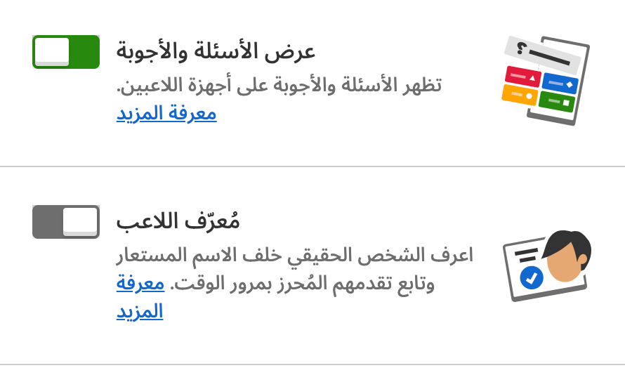
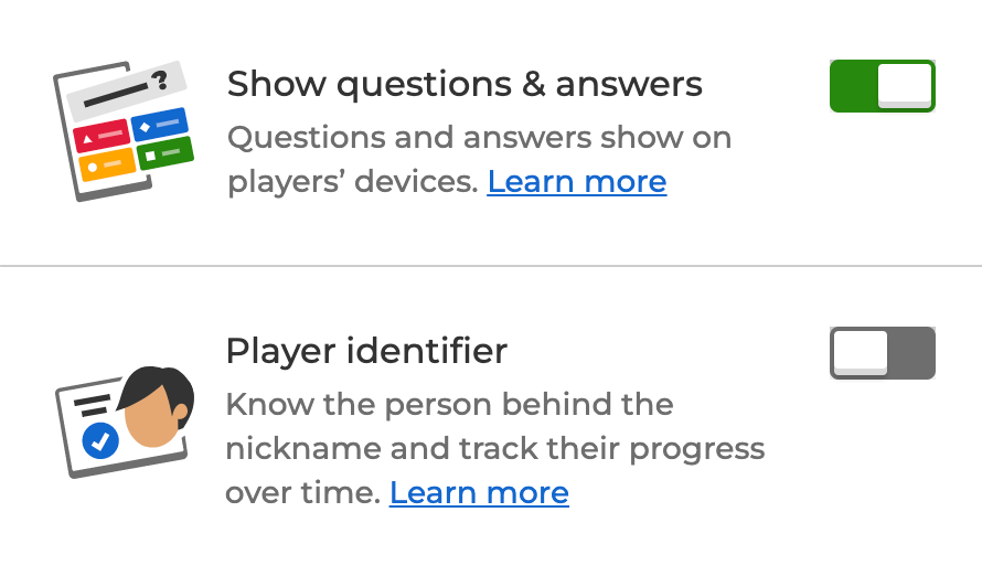
When supporting both directions on the platform you need to make sure you use the correct CSS styling. In the English language text starts from the left but in Arabic, it starts from the right. That’s why such styles like text-align: left; should be avoided. Instead of left and right you can use logical values start and end. Text will be aligned to the start (end) of the line depending on the content direction.
text-align: left after we switch to Arabic:
text-align: start when UI is in English:
text-align: start after we switch to Arabic:
There is quite a long list of logical operators now. For example: margin-inline-start, margin-inline-end, inset-inline-start, padding-inline-start, etc. They have quite a good browser support. You can check them here.
In case logical operators are not enough or you need to support old browsers, you can either create some custom function that will receive language direction value and styles that need to be applied and return correct styles or use some external package that will do this work for you (for example, rtlcss or rtl-css-js).
Fonts
Not all fonts support Arabic. So instead of falling back to some default font that supports it, we had to find a way how we can actually use the desired font. In our case, we have 2 preferred fonts “Noto Sans Arabic” for Arabic and “Montserrat” for all other languages.
According to the way how CSS works, it starts with the first font in a list and tries to apply it to the text and all other characters on the page. If such font doesn’t support some of the characters, it falls to the next font in the list, and so on.
What we decided to do is place the main font (“Montserrat”) in the first place in the list. It will ensure that all supported by the platform languages (except Arabic, of course) will use this font. In the second place, we put “Noto Sans Arabic”. In such a case “Noto Sans Arabic” is a fallback font for the Arabic language.
font-family: Montserrat, "Noto Sans Arabic", "Helvetica Neue", Helvetica, Arial, sans-serif;As a result, placing fonts in the order above helped us to avoid some workarounds with checking the language and loading fonts depending on the user’s language.
Icons
This is a small and maybe not that visible change we made but it makes the application look more natural for the users that are used to RTL content.
When the user switches to Arabic, we change not only the texts and placement of the element but some of the icons and illustrations too.
![]()
![]()
![]()
Mixing content in different directions
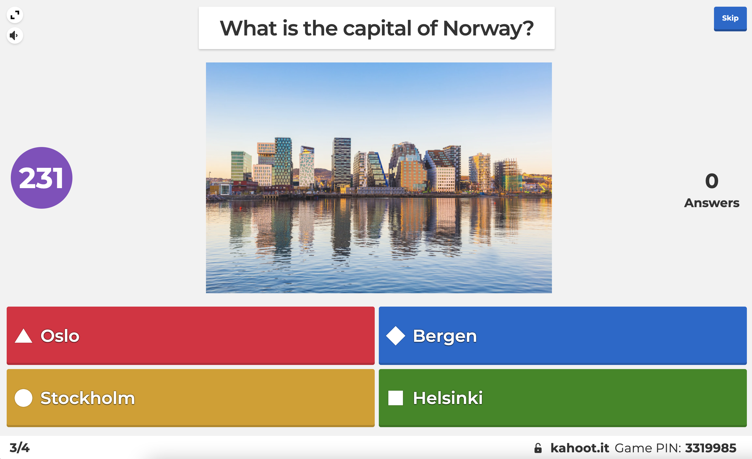
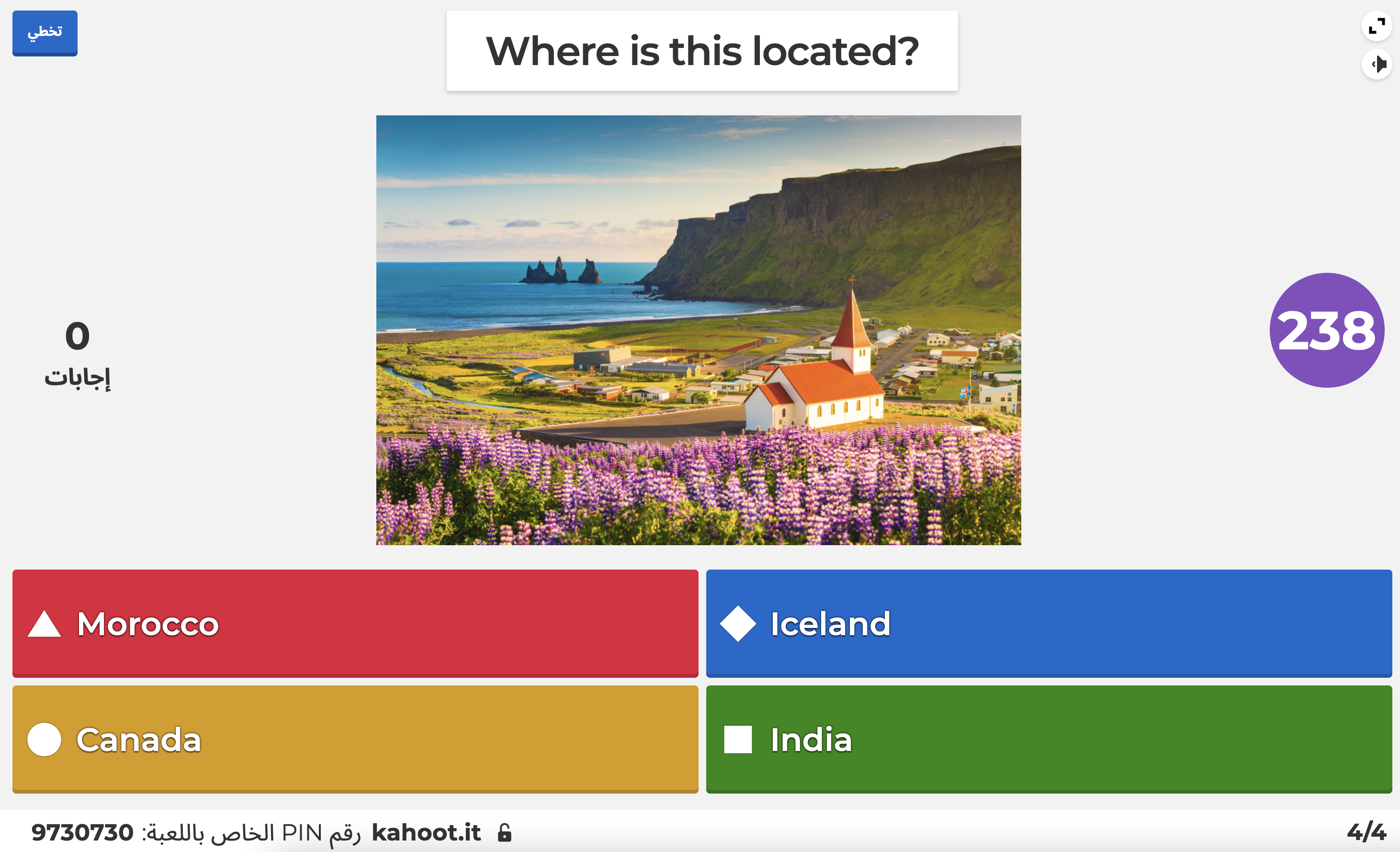
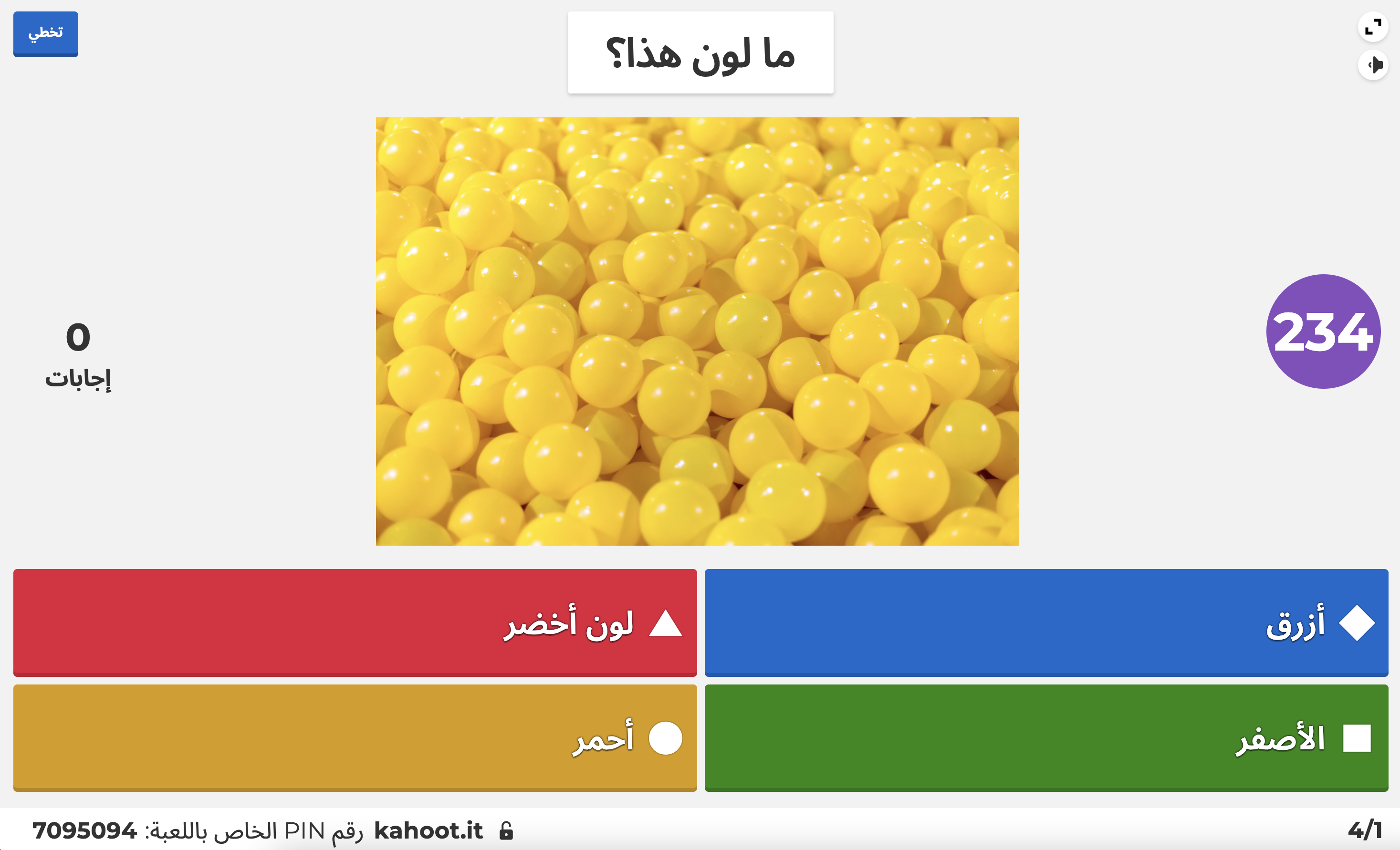
This is the most interesting part of implementing RTL support. Let’s say you have a kahoot in English (questions, answers, slides, etc. are in English) but you prefer Arabic UI. In this case, we need to combine left-to-right content with right-to-left UI. All the questions, answers, and slides should be left-aligned but buttons, labels, navigation, etc. on the page should respect right-to-left rules.
English kahoot within English UI:
English kahoot within Arabic UI:
Arabic kahoot within Arabic UI:
Arabic kahoot within English UI:
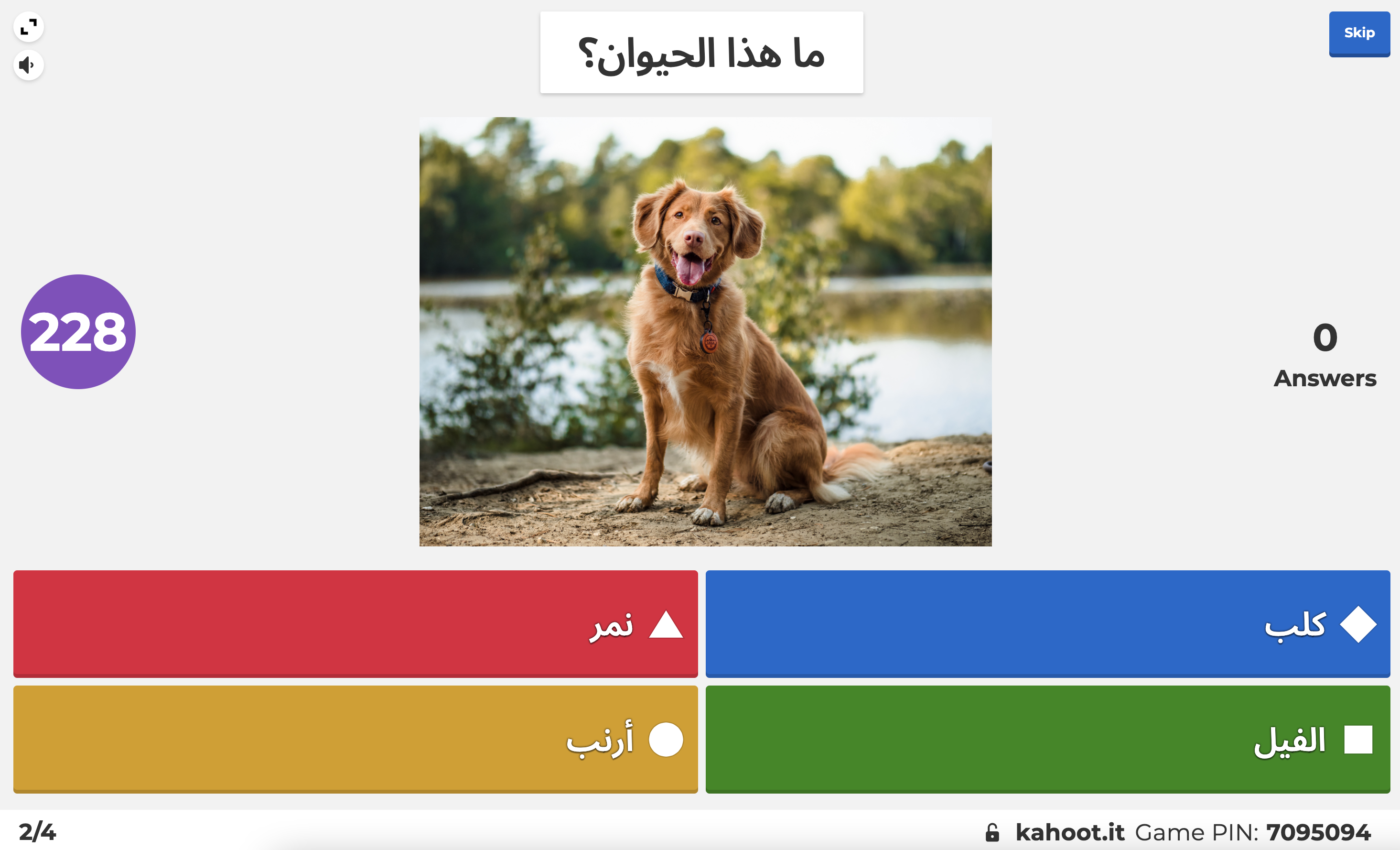
As you can see, we are keeping content according to the kahoot main language direction which is set while creating the kahoot but all other elements are aligned according to the UI language direction.
To achieve it, we need to:
- Get 2 language values: kahoot language and UI language;
- Treat elements on the page differently. Let’s call them content-providing elements and UI-providing elements.
According to UI language, we will set the dir attribute of the <html /> tag. This will make all the elements on the page align according to UI language direction.
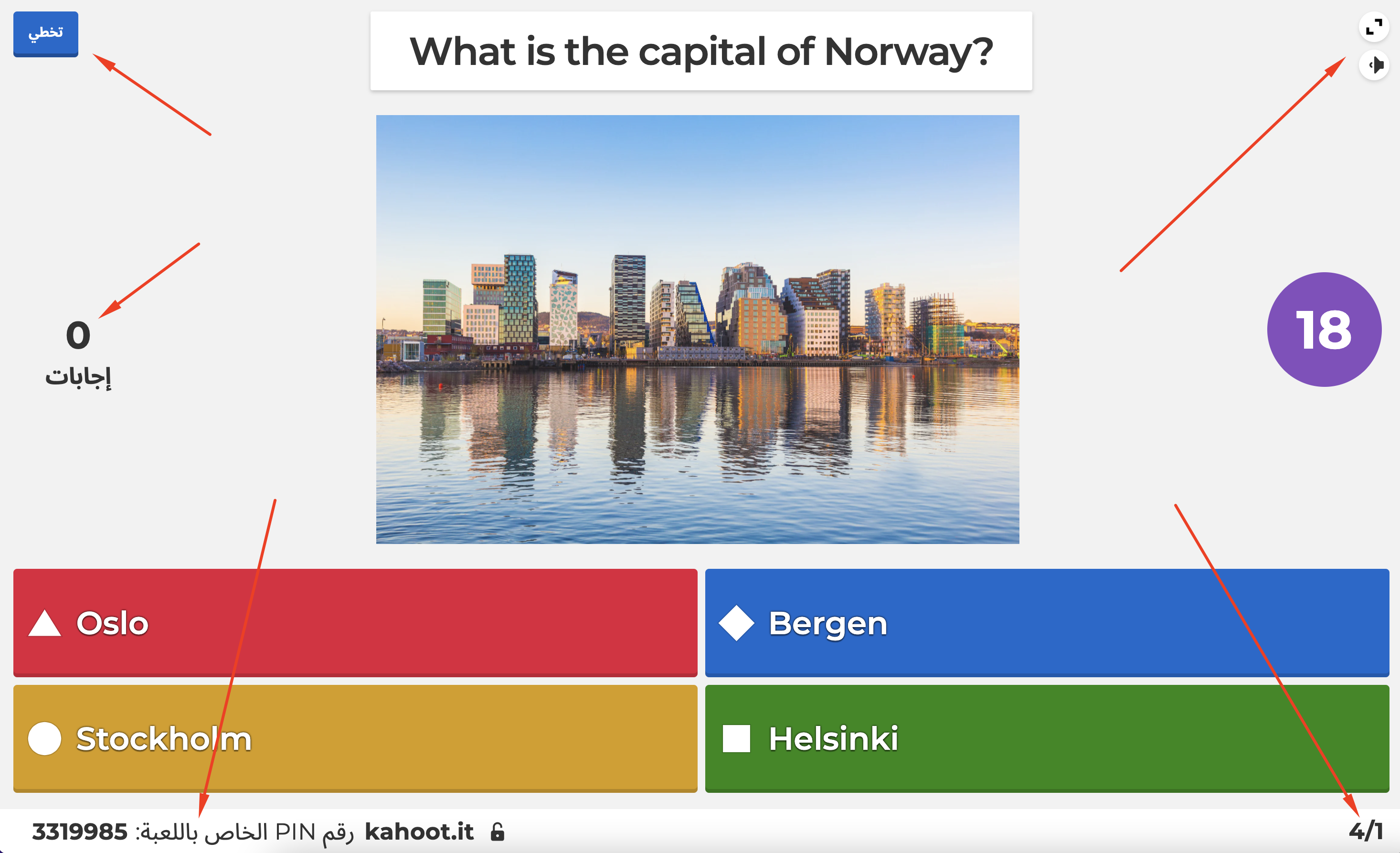
Then we need to set the dir attribute depending on the kahoot language direction to all the content-providing elements. For example, these:
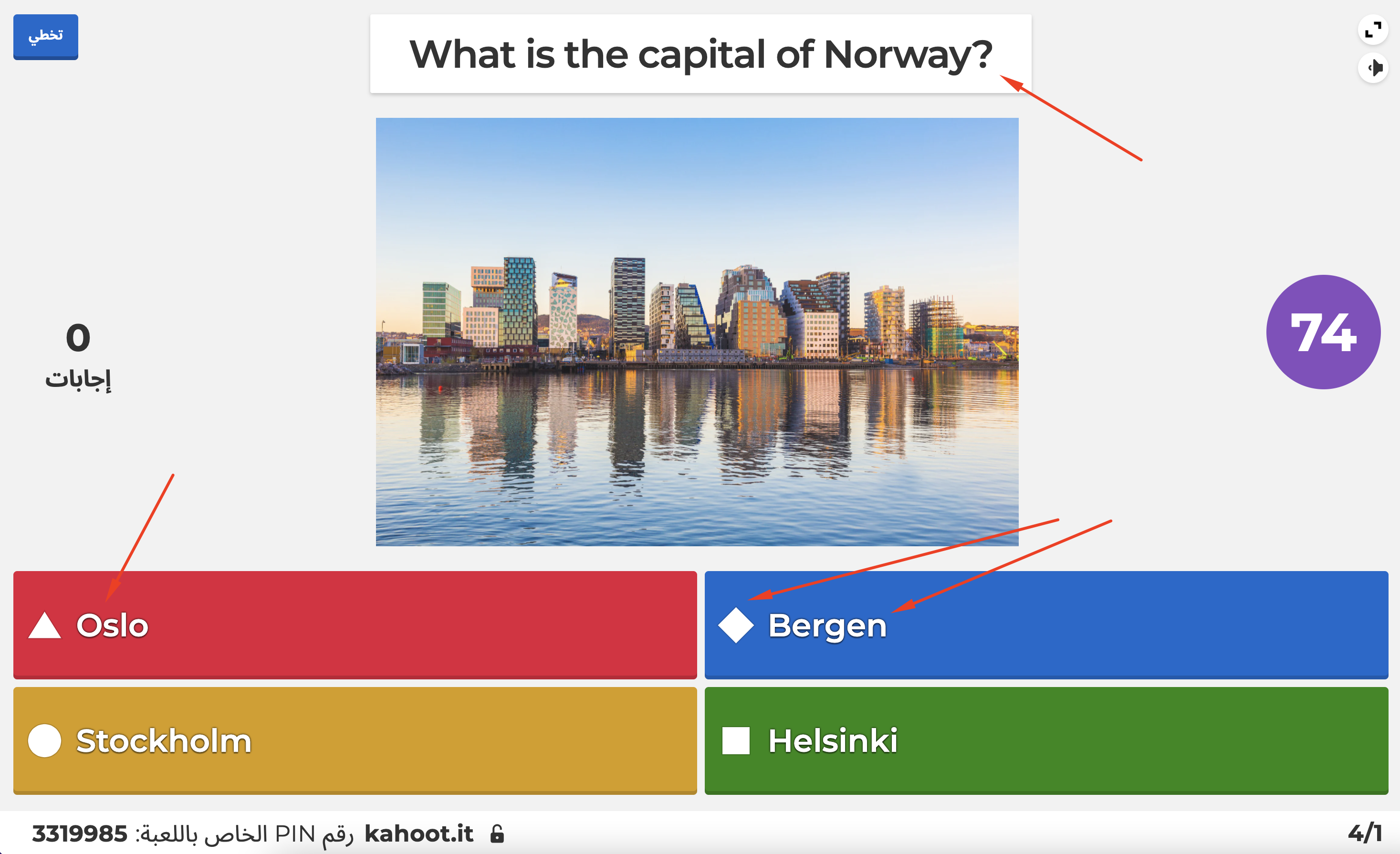
As a result, content-providing elements will be aligned according to kahoot language and UI-providing elements will be aligned according to UI language.
Implementing right-to-left language support is quite a time- and brain-consuming task. But it makes the usage of our platform much easier and more inclusive for the users.
We are growing the team. Curious about joining the K!rew? https://kahoot.com/open-positions/


