
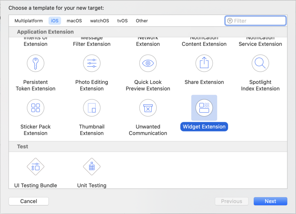
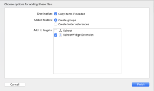
Let’s get started! In Xcode, create a new project called Kahoot, then, click File → New → Target and select “Widget Extension”.
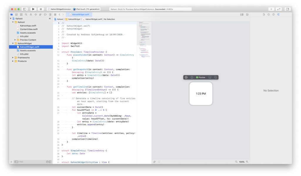
Name it “KahootWidget” and open the KahootWidget.swift file in the KahootWidget folder to verify that it renders in the preview:
Widgets
In broad terms, a widget is a series of timeline events accompanied by SwiftUI backed views. We’ll touch upon all parts in this blog post, but let’s start by creating the view using dummy data.
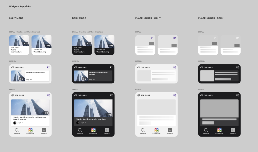
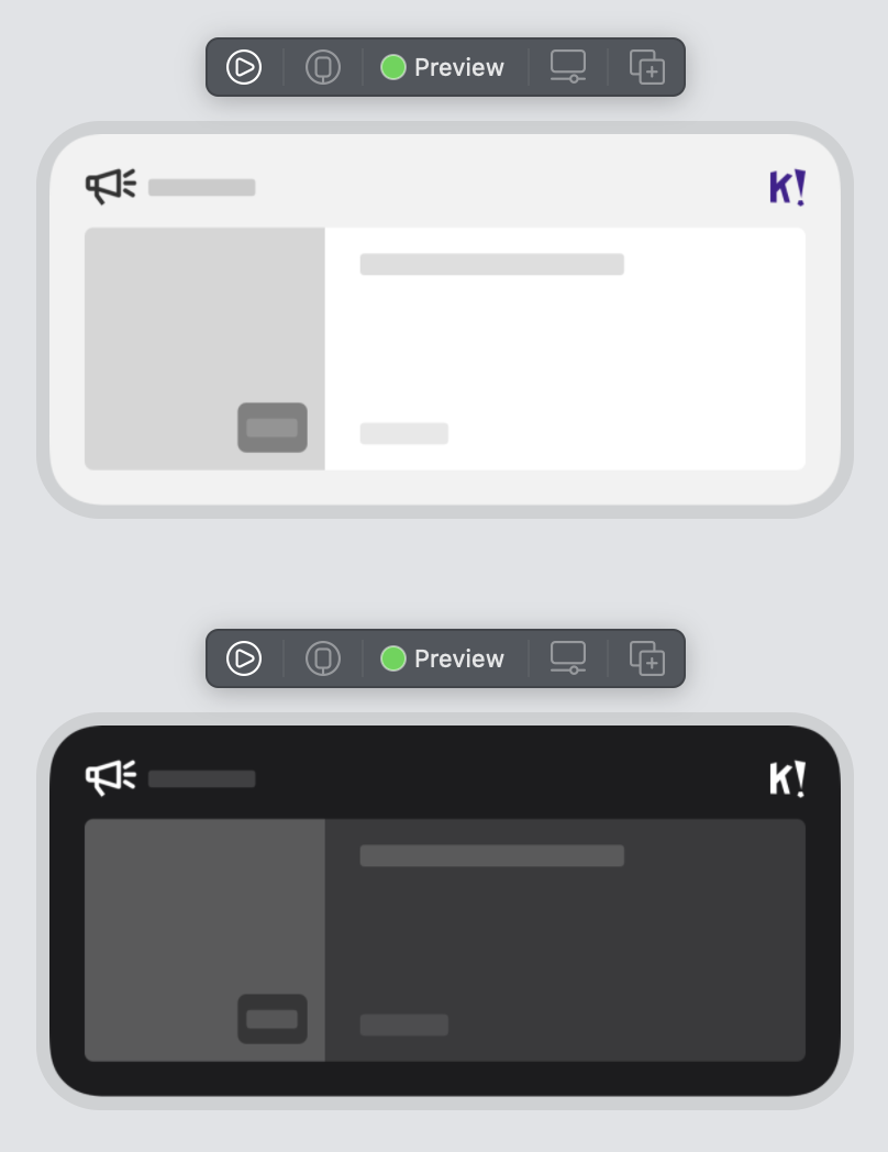
Our designer provided us with the following sketch of the discover group widget:
Small widget
Let’s start by creating the smallest widget as it’s the simplest of the lot.
Locate this view code in KahootWidget.swift:
struct KahootWidgetEntryView : View {
    var entry: Provider.Entry

    var body: some View {
        Text(entry.date, style: .time)
    }
}
Right off the bat, it looks like we need a few vertical stacks (VStack). Command-click on the Text element and select “embed in VStack.”
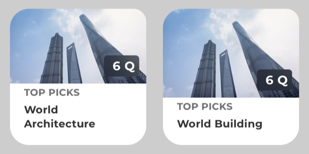
For now, let’s hard-code both images and text, so change the Text element to Text("World Architecture"), and add another above it saying “Top picks”, like so:
struct KahootWidgetEntryView : View {
    var entry: Provider.Entry

    var body: some View {
        VStack {
            Text("TOP PICKS")
            Text("World architecture")
        }
    }
}
Next, let’s add a dummy image, which can be found here. In the project navigator, open the Assets.xcassets inside the KahootWidget folder and, from the “+” menu at the bottom, choose “Image Set.” Name it “DummyImage” and drag and drop an image into the 3x frame. To show it, add an Image above the Text elements, like so:
struct KahootWidgetEntryView : View {
var entry: Provider.Entry
var body: some View {
VStack {
Image("DummyImage")
Text("TOP PICKS")
Text("World architecture")
}
}
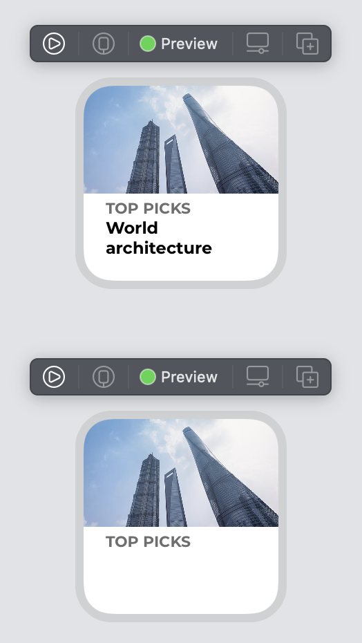
}Let’s take a look at where we’re at by refreshing the preview.
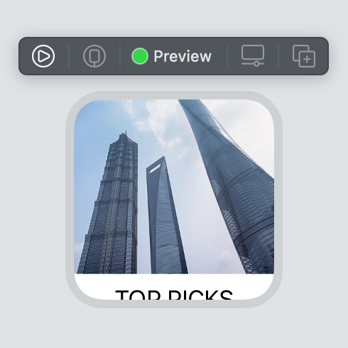
Nice! We’re getting somewhere, but we see that the image pushes the rest of the content out of the frame. Let’s fix that now. The image needs a modifier called .resize() to allow it to be resized and another one called .scaledToFill() to make sure it will fill the available space without being distorted. So, the updated code should look like this:
struct KahootWidgetEntryView : View {
    var entry: Provider.Entry

    var body: some View {
        VStack {
            Image("DummyImage")
                .resizable()
                .scaledToFill()
            Text("TOP PICKS")
            Text("World architecture")
        }
    }
}
And as we can see from the preview, it looks much better now:
Next, let’s style the text and paddings. Reviewing the sketch, we see that we need to adjust the font type, padding, and alignment of the text. There are several ways to solve this, but let’s start by wrapping the two Text elements in a VStack and adding a default padding. Let’s also set alignment: .leading to both the inner and outer VStack to make sure the text aligns nicely.
struct KahootWidgetEntryView : View {
var entry: Provider.Entry
var body: some View {
VStack(alignment: .leading) {
Image("DummyImage")
.resizable()
.scaledToFill()
VStack(alignment: .leading) {
Text("TOP PICKS")
Text("World architecture")
}.padding()
}
}
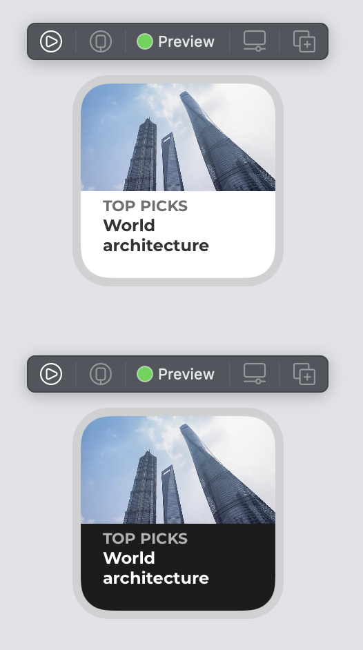
}Refresh the preview, and we get:
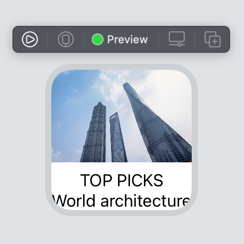
There are a few issues here. The image is too big, pushing the rest of the content out of the screen. To get better control of the image size, let’s wrap the image in a GeometryReader, which will give us the width and height of the available space after the rest of the content has been laid out. We’ll use that info to add a frame modifier, and finally, we need to add the clipped modifier so that the image won’t spill out of its boundaries. We also added spacing: 0 to the outer VStack so that we can control the padding around the text. These changes give us the following code:
struct KahootWidgetEntryView : View {
    var entry: Provider.Entry

    var body: some View {
        VStack(alignment: .leading, spacing: 0) {
            GeometryReader { geometryProxy in
                Image("DummyImage")
                    .resizable()
                    .scaledToFill()
                    .frame(width: geometryProxy.size.width,
                           height: geometryProxy.size.height)
                    .clipped()
            }
            VStack(alignment: .leading) {
                Text("TOP PICKS")
                Text("World architecture")
            }.padding()
        }
    }
}
Refresh the preview again:
Continuing, the padding above TOP PICKS is too big. But first, let’s add the custom font. The widget uses Montserrat bold here, which can be downloaded for free. Drag the Montserrat-Bold.ttf file into your KahootWidget folder in the project navigator, and make sure that KahootWidgetExtension is selected:
Open the Info.plist and add a new array, “Fonts provided by application” and add the name of the file you just added, like so:
Now, let’s use it by adding the .fonts and .bold modifier:
VStack(alignment: .leading) {
Text("TOP PICKS")
.font(.custom("Montserrat", size: 11, relativeTo: .title))
.bold()
Text("World architecture")
.font(.custom("Montserrat", size: 12, relativeTo: .body))
.bold()
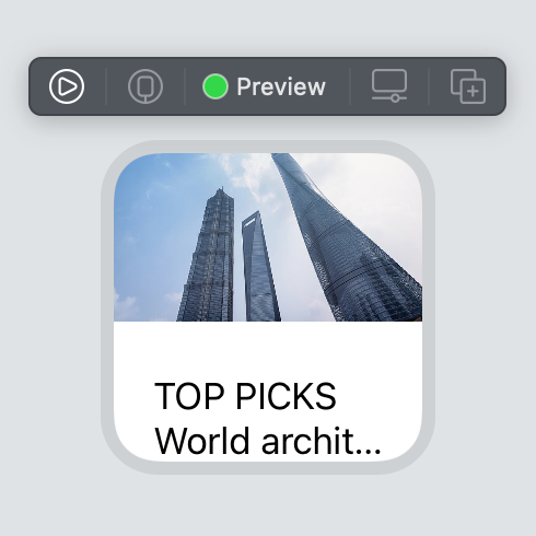
}.padding()We’re using the relativeTo here on the custom font so that it’ll scale nicely with Dynamic Type, which is really important for accessibility. We also added the grey color to the title. The last thing to fix is the padding above the title, let’s change that to .padding(EdgeInsets(top: 4, leading: 16, bottom: 16, trailing: 16)). We’ll also add the .lineLimit modifier to make sure the title is always 1 line, while the body might be 2.
Great, so the full code of this view looks like this:
struct KahootWidgetEntryView : View {
    var entry: Provider.Entry

    var body: some View {
        VStack(alignment: .leading, spacing: 0) {
            GeometryReader { geometryProxy in
                Image("DummyImage")
                    .resizable()
                    .scaledToFill()
                    .frame(width: geometryProxy.size.width, height: geometryProxy.size.height)
                    .clipped()
            }
            VStack(alignment: .leading) {
                Text("TOP PICKS")
                    .font(.custom("Montserrat", size: 11, relativeTo: .title))
                    .foregroundColor(Color(red: 110/255, green: 110/255, blue: 110/255))
                    .bold()
                    .lineLimit(1)
                Text("World architecture")
                    .font(.custom("Montserrat", size: 12, relativeTo: .body))
                    .lineLimit(2)

            }.padding(EdgeInsets(top: 4, leading: 16, bottom: 16, trailing: 16))

        }
    }
}
Looking back at the sketch, we haven’t addressed dark mode yet.
Replace the KahootWidget_Previews at the bottom of the file with the following code:
struct KahootWidgetSmallView_Previews: PreviewProvider {
static var previews: some View {
ForEach(ColorScheme.allCases, id: \.self) { colorScheme in
KahootWidgetEntryView(entry: SimpleEntry(date: Date()))
.previewContext(WidgetPreviewContext(family: .systemSmall))
.environment(\.colorScheme, colorScheme)
}
}
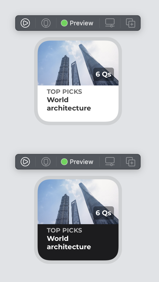
}This will simply loop through the color schemes and show a preview for each of them. Let’s take a look a the result:
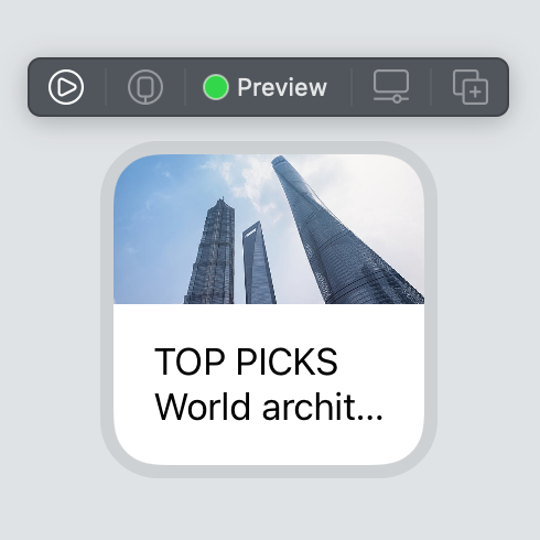
It looks like we need to adjust both the text and background color, so let’s do that now. Open the asset catalog and add three new colors:
Backgroundusing white as Any Appearance and#1C1C1Eas Dark Appearance.Gray4using#6E6E6Eas Any Appearance and Dark Appearance#B2B2B2.Gray5using#333333as Any Appearance and white as Dark Appearance.
Now, let’s use the colors in our code:
struct KahootWidgetEntryView : View {
var entry: Provider.Entry
var body: some View {
VStack(alignment: .leading, spacing: 0) {
GeometryReader { geometryProxy in
Image("DummyImage")
.resizable()
.scaledToFill()
.frame(width: geometryProxy.size.width, height: geometryProxy.size.height)
.clipped()
}
VStack(alignment: .leading) {
Text("TOP PICKS")
.font(.custom("Montserrat", size: 11, relativeTo: .title))
.foregroundColor(Color("Gray4"))
.bold()
.lineLimit(1)
Text("World architecture")
.font(.custom("Montserrat", size: 12, relativeTo: .body))
.foregroundColor(Color("Gray5"))
.lineLimit(2)
}
.padding(EdgeInsets(top: 4, leading: 16, bottom: 16, trailing: 16))
}.background(Color("Background"))
}
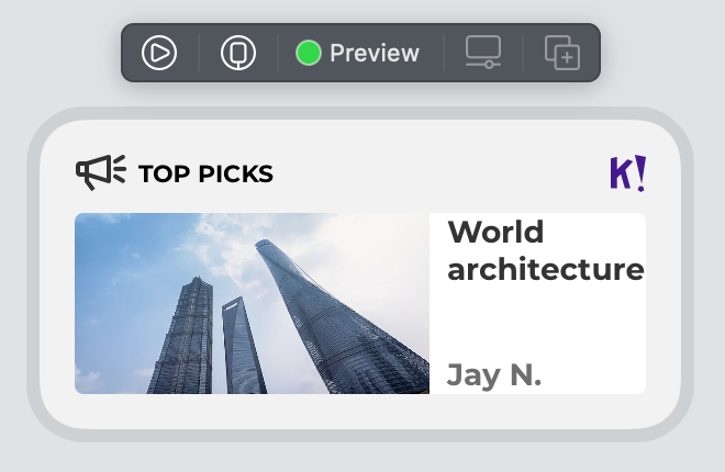
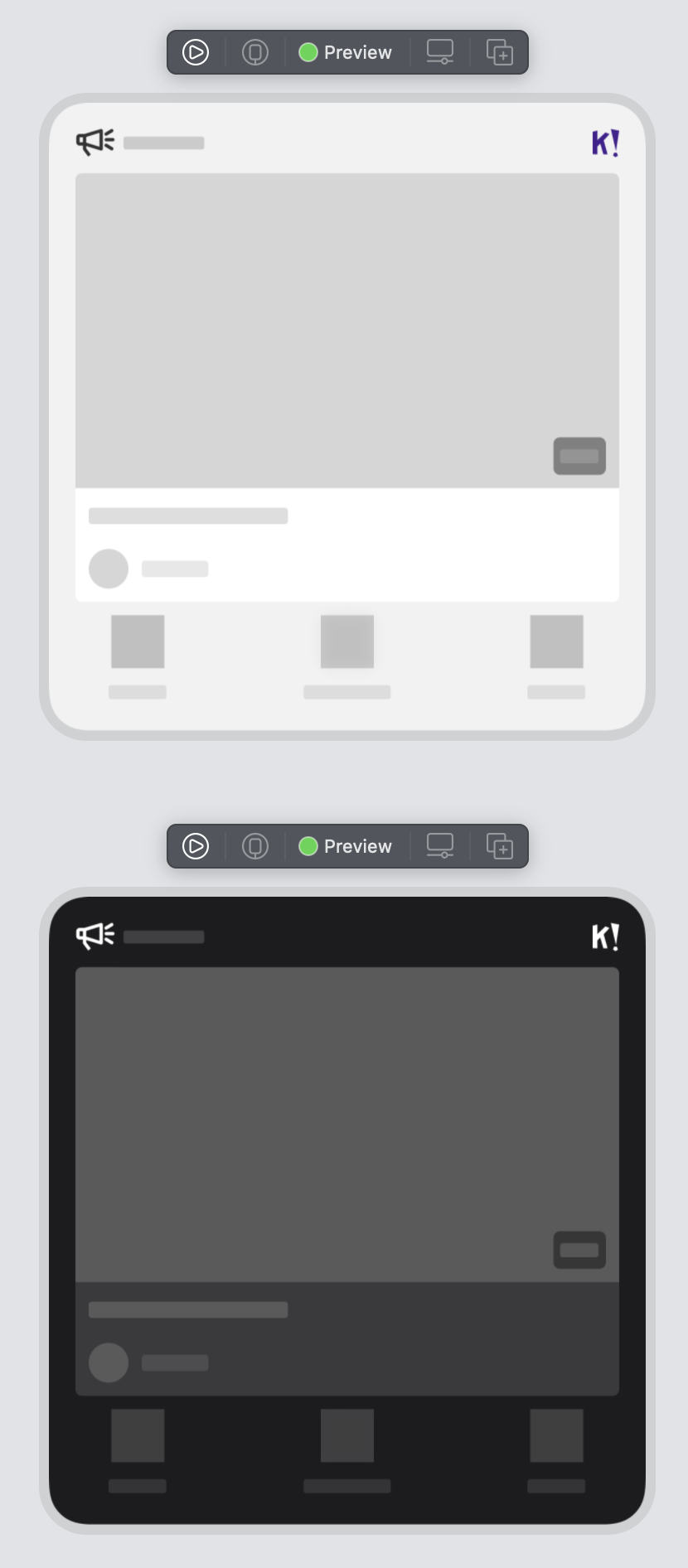
}That looks great:
There’s just one element missing: the number of questions in the lower right corner of the image. For this, we can add a bottom trailing overlay over the image. Start by adding a new black color to the asset catalog with 40% opacity in Any Appearance, naming it NumberOfQsBackground. Then add this code after the .clipped():
.overlay(
    Text("6 Qs")
    .font(.custom("Montserrat", size: 12, relativeTo: .title))
    .bold()
    .foregroundColor(.white)
    .padding(4)
    .background(Color("NumberOfQsBackground"))
    .cornerRadius(4)
    .padding(8)
, alignment: .bottomTrailing)
The full code will look like this:
struct KahootWidgetEntryView : View {
    var entry: Provider.Entry

    var body: some View {
        VStack(alignment: .leading, spacing: 0) {
            GeometryReader { geometryProxy in
                Image("DummyImage")
                    .resizable()
                    .scaledToFill()
                    .frame(width: geometryProxy.size.width,
                           height: geometryProxy.size.height)
                    .clipped()
                    .overlay(
                        Text("6 Qs")
                            .font(.custom("Montserrat", size: 12, relativeTo: .title))
                            .bold()
                            .foregroundColor(.white)
                            .padding(4)
                            .background(Color("NumberOfQsBackground"))
                            .cornerRadius(4)
                            .padding(8)
                        , alignment: .bottomTrailing)
            }
            VStack(alignment: .leading) {
                Text("TOP PICKS")
                    .font(.custom("Montserrat", size: 11, relativeTo: .title))
                    .bold()
                    .foregroundColor(Color("Gray4"))
                    .lineLimit(1)
                Text("World architecture")
                    .font(.custom("Montserrat", size: 12, relativeTo: .body))
                    .bold()
                    .foregroundColor(Color("Gray5"))
                    .lineLimit(2)

            }
            .padding(EdgeInsets(top: 4, leading: 16, bottom: 16, trailing: 16))

        }.background(Color("Background"))

    }
}
Let’s update our preview for the last time:
If you’re going crazy with all the things you’d like to refactor and simplify, don’t worry. We’ll revisit this code later on!
And that’s it for the small widget. Let’s continue with the medium and large ones!
Medium widget
Let’s review the medium-sized widget from the sketch:
As we can see, the content is pretty much the same, with the exception of the username. Now is a good time to create a data model that will back the views. Add a new file called DiscoverGroup.swift, with the current content:
import SwiftUI
struct DiscoverGroup {
let cardTitle: String
let coverImage: Image
let creatorAvatarImage: Image?
let creatorUsername: String
let groupTitle: String
let numberOfQuestions: Int
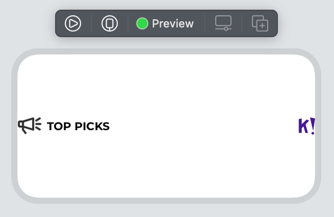
}Then, create a new SwiftUI file called MediumWidgetView.swift and start building the UI. Add the loudspeaker icon and Kahoot! logo to the assets catalog, naming them K!Logo and DiscoverGroupIcon, respectively. Let’s start by creating the header.
Ideally, we’d use the new Label to build the icon and title, but there’s currently a bug where the icon and title will not align vertically, so let’s do it with an Image and Text element instead. A Spacer element will be used to push the Kahoot! logo all the way to the right, like so:
struct MediumWidgetView: View {
let discoverGroup: DiscoverGroup
var body: some View {
HStack(spacing: 5) {
Image("DiscoverGroupIcon")
Text(discoverGroup.groupTitle)
.font(.custom("Montserrat", size: 11, relativeTo: .headline))
.bold()
.lineLimit(2)
.textCase(.uppercase)
Spacer()
Image("K!Logo")
}
}
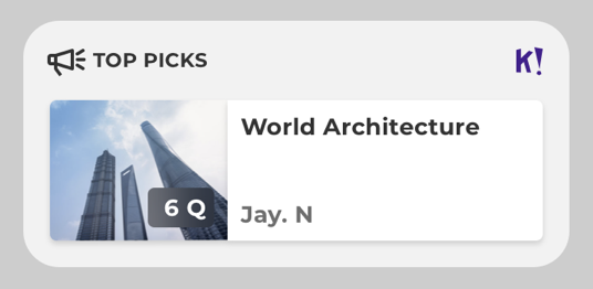
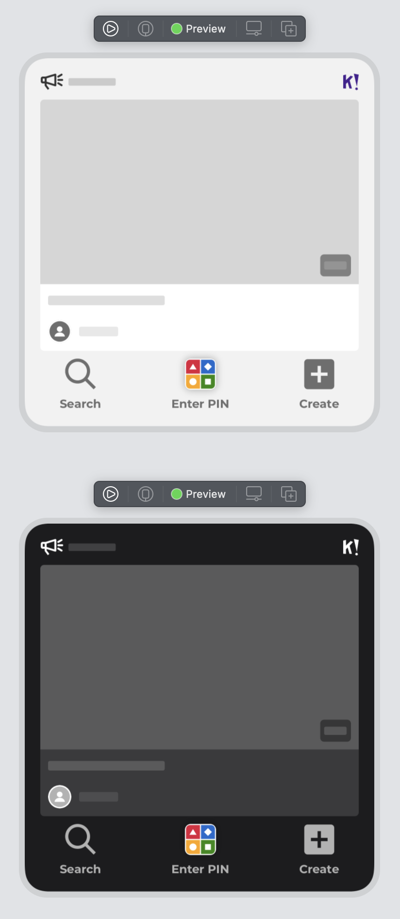
}Here, we also use the newly created DiscoverGroup data model. Let’s create a preview for this view using the data from the sketch, and review it.
struct MediumWidgetView_Previews: PreviewProvider {
    static var previews: some View {

        let discoverGroup = DiscoverGroup(cardTitle: "World architecture",
                                          coverImage: Image("DummyImage"),
                                          creatorAvatarImage: nil,
                                          creatorUsername: "Jay N.",
                                          groupTitle: "Top picks",
                                          numberOfQuestions: 6)

        MediumWidgetView(discoverGroup: discoverGroup)
            .previewContext(WidgetPreviewContext(family: .systemMedium))
    }
}
The preview now looks like this:
Neat! Next, let’s wrap it in a VStack and add another HStack that will contain the image, card title, and creator username. The card title and creator username will themselves be wrapped in a VStack with a Spacer between to push them to the top and bottom edges:
HStack {
    discoverGroup.coverImage
        .resizable()
    VStack(alignment: .leading) {
        Text(discoverGroup.cardTitle)
            .font(.custom("Montserrat", size: 14, relativeTo: .title))
            .bold()
            .foregroundColor(Color("Gray5"))
        Spacer()
        Text(discoverGroup.creatorUsername)
            .font(.custom("Montserrat", size: 14, relativeTo: .title))
            .bold()
            .lineLimit(1)
            .foregroundColor(Color("Gray4"))
        }
    }
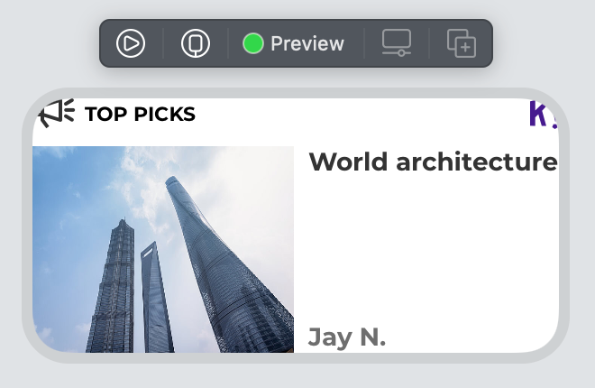
OK, it looks like we need padding on the outer VStack and a few new background colors:
CardBackgroundusing white as Any Appearance and#3A3A3Cas Dark Appearance.MediumAndLargeWidgetBackgroundusing#F2F2F2as Any Appearance and Dark Appearance#1C1C1E.
While you’re at it, rename the original Background color to SmallWidgetBackground and update the small widget code to reflect the change.
With the latest changes, we have:
struct MediumWidgetView: View {

    let discoverGroup: DiscoverGroup

    var body: some View {
        VStack {
            HStack(spacing: 5) {
                Image("DiscoverGroupIcon")
                Text(discoverGroup.groupTitle)
                    .font(.custom("Montserrat", size: 11, relativeTo: .headline))
                    .bold()
                    .lineLimit(2)
                    .textCase(.uppercase)
                Spacer()
                Image("K!Logo")
            }
            HStack {
                discoverGroup.coverImage
                    .resizable()
                VStack(alignment: .leading) {
                    Text(discoverGroup.cardTitle)
                        .font(.custom("Montserrat", size: 14, relativeTo: .title))
                        .bold()
                        .foregroundColor(Color("Gray5"))
                    Spacer()
                    Text(discoverGroup.creatorUsername)
                        .font(.custom("Montserrat", size: 14, relativeTo: .title))
                        .bold()
                        .lineLimit(1)
                        .foregroundColor(Color("Gray4"))
                }
            }
            .background(Color("CardBackground"))
            .cornerRadius(4)
        }
        .padding()
        .background(Color("MediumAndLargeWidgetBackground"))
    }
}
Next, let’s figure out how to scale the image properly. In the sketch, it has a fixed size, but widget’s actual size will vary depending on the device where it is displayed. However, it looks like that image should take about a third of the width of the “card” it is shown inside. GeometryReader comes to the rescue once again. Wrap the image and texts HStack in it, and change the Image to:
discoverGroup.image
    .resizable()
    .scaledToFill()
    .frame(width: geometryProxy.size.width/3,
           height: geometryProxy.size.height)
    .clipped()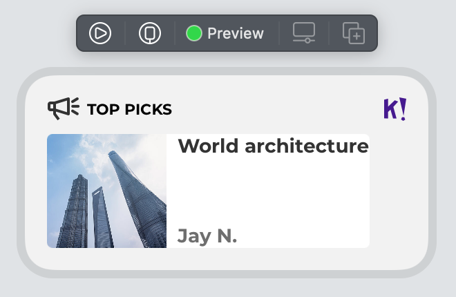
Much better, but we also need to add some padding around the texts and make the card go all the way to the edge.
Add these modifiers to the VStack to accomplish that:
.frame(maxWidth: .infinity, alignment: .leading)
.padding(8)
The final step is to add the number of questions tag that we created for the small widget in the lower right-hand side of the image.
Let’s refactor the code we made earlier to a View extension. Create a new file called View+Extensions.swift with the following code:
import Foundation
import SwiftUI

extension View {
    func numberOfQuestions(_ numberOfQuestions: Int) -> some View {
        self
            .overlay(
                Text("\(numberOfQuestions) Qs")
                    .font(.custom("Montserrat", size: 12, relativeTo: .title))
                    .bold()
                    .foregroundColor(.white)
                    .padding(4)
                    .background(Color("NumberOfQsBackground"))
                    .cornerRadius(4)
                    .padding(8),
                alignment: .bottomTrailing
            )
    }
}
This will overlay any view with the number of Qs view. Then it’s just a matter of adding .numberOfQuestions(discoverGroup.numberOfQuestions) after the clipped modifier on the image, and we’re done with the medium view. Let’s also change the preview to include dark mode to check that it looks good:
struct MediumWidgetView_Previews: PreviewProvider {
    static var previews: some View {

        let discoverGroup = DiscoverGroup(cardTitle: "World architecture",
                                          coverImage: Image("DummyImage"),
                                          creatorAvatarImage: nil,
                                          creatorUsername: "Jay N.",
                                          groupTitle: "Top picks",
                                          numberOfQuestions: 6)

        ForEach(ColorScheme.allCases, id: \.self) { colorScheme in
            MediumWidgetView(discoverGroup: discoverGroup)
                .previewContext(WidgetPreviewContext(family: .systemMedium))
                .environment(\.colorScheme, colorScheme)
        }
    }
}
Looks great! Before creating the large widget, it’s a good time to do a bit of refactoring on the small widget, using the discover group data model we created and using the new number of questions View extension. Create a new SwiftUI file called SmallWidgetView.swift and move the body code from KahootWidgetEntryView there. Then, replace the data as described above, and we’ll end up with this code:
struct SmallWidgetView: View {

    let discoverGroup: DiscoverGroup

    var body: some View {
        VStack(alignment: .leading, spacing: 0) {
            GeometryReader { geometryProxy in
                discoverGroup.coverImage
                    .resizable()
                    .scaledToFill()
                    .frame(width: geometryProxy.size.width,
                           height: geometryProxy.size.height)
                    .clipped()
                    .numberOfQuestions(discoverGroup.numberOfQuestions)
            }
            VStack(alignment: .leading) {
                Text(discoverGroup.groupTitle)
                    .font(.custom("Montserrat", size: 11, relativeTo: .title))
                    .bold()
                    .foregroundColor(Color("Gray4"))
                    .textCase(.uppercase)
                    .lineLimit(1)
                Text(discoverGroup.cardTitle)
                    .font(.custom("Montserrat", size: 12, relativeTo: .body))
                    .bold()
                    .foregroundColor(Color("Gray5"))
                    .lineLimit(2)

            }
            .padding(EdgeInsets(top: 4, leading: 16, bottom: 16, trailing: 16))

        }.background(Color("SmallWidgetBackground"))

    }

}
As the last step, we need to tell KahootWidgetEntryView which view to show based on its size. This requires a bit of refactoring, but let’s start by adding the DiscoverGroup data model to the Entry object. Start by renaming SimpleEntry to WidgetTimelineEntry and add the discover group, like so:
struct WidgetTimelineEntry: TimelineEntry {
    let date: Date
    let discoverGroup: DiscoverGroup
}
This means we need to provide a discover group object in the placeholder, getSnapshot, and getTimeline.
The placeholder will show while data is loading, so the text will be redacted. That means we don’t have to provide any meaningful data, so let’s create an object, like this:
func placeholder(in context: Context) -> WidgetTimelineEntry {
        let discoverGroup = DiscoverGroup(cardTitle: "------------",
                                          coverImage: Image("DummyImage"),
                                          creatorAvatarImage: nil,
                                          creatorUsername: "------",
                                          groupTitle: "--------",
                                          numberOfQuestions: 10)
        return WidgetTimelineEntry(date: Date(), discoverGroup: discoverGroup)
    }
Next, let’s take a look at getSnapshot. This function needs to return a timeline object that will be displayed in the widget gallery, so here we should provide valid dummy data:
    func getSnapshot(in context: Context, completion: @escaping (WidgetTimelineEntry) -> ()) {

        let discoverGroup = DiscoverGroup(cardTitle: "World architecture",
                                          coverImage: Image("DummyImage"),
                                          creatorAvatarImage: nil,
                                          creatorUsername: "Jay N.",
                                          groupTitle: "Top picks",
                                          numberOfQuestions: 6)

        let entry = WidgetTimelineEntry(date: Date(), discoverGroup: discoverGroup)
        completion(entry)
    }
Finally, getTimeline needs to return an array of timeline events. For this exercise, let’s return just one element that will refresh after an hour. We will revisit this code later on when we’re going to display data from the backend:
func getTimeline(in context: Context, completion: @escaping (Timeline<Entry>) -> ()) {

        let discoverGroup = DiscoverGroup(cardTitle: "World architecture",
                                          coverImage: Image("DummyImage"),
                                          creatorAvatarImage: nil,
                                          creatorUsername: "Jay N.",
                                          groupTitle: "Top picks",
                                          numberOfQuestions: 6)

        let entry = WidgetTimelineEntry(date: Date(), discoverGroup: discoverGroup)

        let date = Calendar.current.date(byAdding: .hour, value: 1, to: Date())!

        let timeline = Timeline(entries: [entry], policy: TimelineReloadPolicy.after(date))

        completion(timeline)
    }
The last step is to update the KahootWidgetEntryView’s body code to display the widget in the correct size:
struct KahootWidgetEntryView : View {
    @Environment(\.widgetFamily) private var widgetFamily
    var entry: Provider.Entry

    var body: some View {
        switch widgetFamily {
        case .systemSmall:
            SmallWidgetView(discoverGroup: entry.discoverGroup)
        case .systemMedium:
            MediumWidgetView(discoverGroup: entry.discoverGroup)
        @unknown default:
            fatalError()
        }

    }
}
And that’s it for the small and medium-sized widget. Let’s do the last one!
Large widget
Let’s review the sketch:
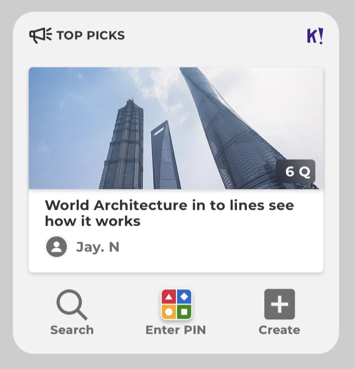
So, this looks like a mix of the heading from the medium widget with the layout from the small one, with the addition of a button row at the bottom.
Let’s start by refactoring the heading from the medium widget to a separate file so that it can easily be reused. Create a new SwiftUI file called HeaderView.swift, moving the following view code from the medium widget:
import SwiftUI
import WidgetKit

struct HeaderView: View {

    let title: String

    var body: some View {
        HStack(spacing: 5) {
            Image("DiscoverGroupIcon")
            Text(self.title)
                .font(.custom("Montserrat", size: 11, relativeTo: .headline))
                .bold()
                .lineLimit(2)
                .textCase(.uppercase)
            Spacer()
            Image("K!Logo")
        }
    }
}

struct HeaderView_Previews: PreviewProvider {
    static var previews: some View {
        HeaderView(title: "Top picks")
            .previewContext(WidgetPreviewContext(family: .systemMedium))
    }
}
Using this view in the medium widget is then as simple as calling HeaderView(title: discoverGroup.groupTitle).
Add a new SwiftUI file called LargeWidgetView.swift and let’s use the newly created HeaderView, as well as set up some previews:
import SwiftUI
import WidgetKit

struct LargeWidgetView: View {

    let discoverGroup: DiscoverGroup

    var body: some View {
        VStack {
            HeaderView(title: discoverGroup.groupTitle)
        }
        .padding()
        .background(Color("MediumAndLargeWidgetBackground"))
    }
}

struct LargeWidgetView_Previews: PreviewProvider {
    static var previews: some View {

        let discoverGroup = DiscoverGroup(cardTitle: "World architecture",
                                          coverImage: Image("DummyImage"),
                                          creatorAvatarImage: nil,
                                          creatorUsername: "Jay N.",
                                          groupTitle: "Top picks",
                                          numberOfQuestions: 6)

        ForEach(ColorScheme.allCases, id: \.self) { colorScheme in
            LargeWidgetView(discoverGroup: discoverGroup)
                .previewContext(WidgetPreviewContext(family: .systemLarge))
                .environment(\.colorScheme, colorScheme)
        }
    }
}
The card code is pretty straightforward as it reuses techniques we’ve already discussed:
VStack(alignment: .leading) {
    Text(discoverGroup.cardTitle)
        .font(.custom("Montserrat", size: 14, relativeTo: .title))
            .bold()
            .lineLimit(2)
            .foregroundColor(Color("Gray5"))
    HStack {
        Group {
            if let creatorAvatarImage = discoverGroup.creatorAvatarImage {
                creatorAvatarImage
                .resizable()
            } else {
                Image("CreatorAvatarMissing")
            }
        }
        .frame(width: 24, height: 24)
        .clipShape(Circle())

        Text(discoverGroup.creatorUsername)
            .font(.custom("Montserrat", size: 14, relativeTo: .title))
            .bold()
            .lineLimit(1)
            .foregroundColor(Color("Gray4"))
    }
}
.padding(8)
Note the code handling is missing creator avatar images, where we fall back on a local image.
Next up, the row of buttons. Add images for Search, Create PIN, and Create in the assets catalog, and add a new SwiftUI file called ButtonRowView.swift. There’s not really a lot of magic going on here.
import SwiftUI
import WidgetKit

struct LinkButtonView: View {
    let imageName: String
    var shadow: Bool = false
    let text: String

    var body: some View {
        VStack {
            Image(imageName)
                .shadow(radius: self.shadow ? 4 : 0)

            Text(text).font(.custom("Montserrat", size: 12, relativeTo: .title))
                .bold()
                .foregroundColor(Color("Gray4"))
        }

    }
}

struct ButtonRowView: View {
    var body: some View {
        HStack(alignment: .top) {
            LinkButtonView(imageName: "Search", text: "Search")
            Spacer()
            LinkButtonView(imageName: "EnterPIN", shadow: true, text: "Enter PIN")
            Spacer()
            LinkButtonView(imageName: "Create", text: "Create")
        }
        .padding(EdgeInsets(top: 0, leading: 20, bottom: 0, trailing: 20))
    }
}

struct ButtonRowView_Previews: PreviewProvider {
    static var previews: some View {
        ForEach(ColorScheme.allCases, id: \.self) { colorScheme in
            ButtonRowView()
                .background(Color("MediumAndLargeWidgetBackground"))
                .previewContext(WidgetPreviewContext(family: .systemLarge))
                .environment(\.colorScheme, colorScheme)
                .previewDisplayName("\(colorScheme)")
        }
    }
}
Let’s use the ButtonRowView in the large widget, and we get:
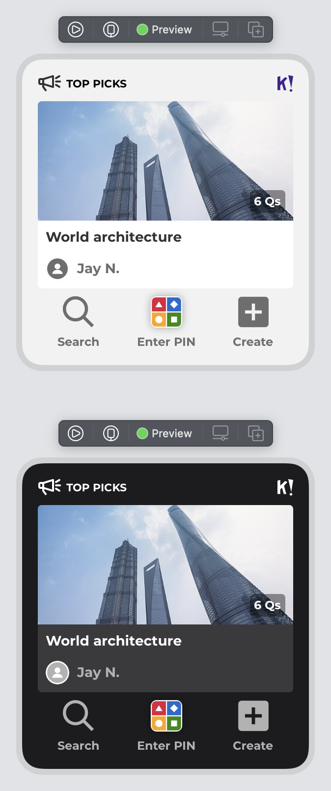
Placeholders
We briefly touched upon placeholders earlier on when implementing the getPlaceholder function. Placeholders are shown when data is loading, so we should revisit how the widgets will look like in that state. In the small widget preview, add .redacted(reason: .placeholder) after the .environment, and we get:
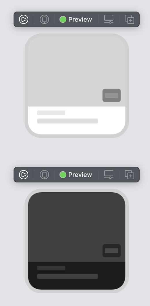
Since all content is dynamic, there’s not really any changes to be done to this placeholder. Let’s check out the medium-sized widget:
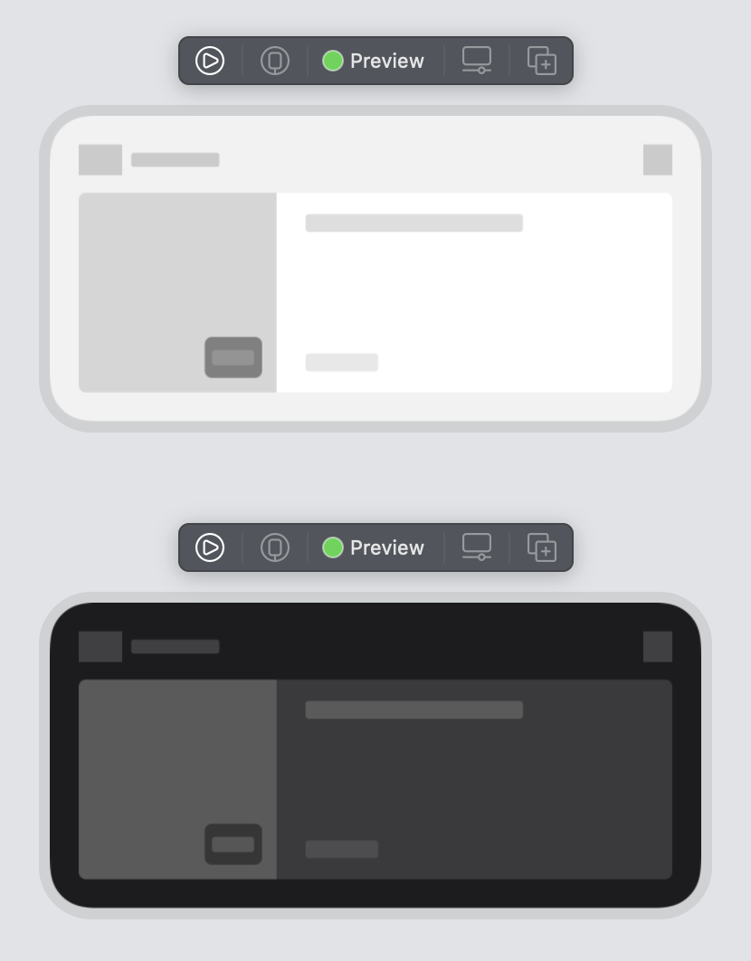
In this case, both the “Top picks” icon and the K! logo should be shown, so let’s add unredacted modifiers to both of them. Open HeaderView.swift and add .unredacted() after the both Image("DiscoverGroupIcon") and `Image(“K!Logo”). Refresh the preview:
Finally, let’s check out the large widget, where the header benefits from the fix we just applied:
Clearly, we need to add unredacted to the placeholder avatar image and the row of buttons, as they won’t change. In LargeWidgetView.swift add .unredacted() to Image("CreatorAvatarMissing") and to the VStack in LinkButtonRow. Refresh:
And that wraps up the UI code.
Networking
The networking part isn’t really specific to widgets, so please take a look at the code in the repo where we’ve included a simple integration. Note that we’re not really handling any errors here, which we, of course, would do in a real-life app.
Opening the app using universal links
The small and medium-sized widgets just have one URL that can be opened when tapped, while the large widget might have several links. Let’s add them.
Open KahootWidget.swift and add let widgetURL: URL to the WidgetTimelineEntry struct. This will result in a few errors in the code that need to be addressed. Add widgetURL: URL(string: "https://kahoot.com")! to both the placeholder and getSnapshot functions. Finally, locate the part where we create the WidgetTimelineEntry object after downloading data from the network. We need to create a deep link based on the quiz’s UUID, like so:
let widgetURL = URL(string: "kahoot://quiz/\(data.card.uuid)")!
let entry = WidgetTimelineEntry(date: Date(),
                                discoverGroup: discoverGroup,
                                widgetURL: widgetURL)
Then, we need to update all the widgets to open using this URL. To achieve this, we can easily wrap the widgetFamily switch in a Group and add the widgetURL modifier, like so:
struct KahootWidgetEntryView : View {
    @Environment(\.widgetFamily) private var widgetFamily
    var entry: Provider.Entry

    var body: some View {
        Group {
            switch widgetFamily {
            case .systemSmall:
                SmallWidgetView(discoverGroup: entry.discoverGroup)
            case .systemMedium:
                MediumWidgetView(discoverGroup: entry.discoverGroup)
            case .systemLarge:
                LargeWidgetView(discoverGroup: entry.discoverGroup)
            @unknown default:
                fatalError()
            }
        }.widgetURL(entry.widgetURL)
    }
}
In addition, the large widget has some links at the bottom that need to be wrapped in Links. Open the LinkButtonView struct, and add let url: URL. Then, wrap the VStack in a Link(destination: url), and add some hard-coded URLs to buttons themselves in ButtonRowView. The final code will look like this:
struct LinkButtonView: View {
    let imageName: String
    var shadow: Bool = false
    let text: String
    let url: URL

    var body: some View {
        Link(destination: url) {
            VStack {
                Image(imageName)
                    .shadow(radius: self.shadow ? 4 : 0)

                Text(text).font(.custom("Montserrat", size: 12, relativeTo: .title))
                    .bold()
                    .foregroundColor(Color("Gray4"))
            }.unredacted()
        }
    }
}

struct ButtonRowView: View {
    var body: some View {
        HStack(alignment: .top) {
            LinkButtonView(imageName: "Search", text: "Search", url: URL(string: "kahoot://search")!)
            Spacer()
            LinkButtonView(imageName: "EnterPIN", shadow: true, text: "Enter PIN", url: URL(string: "kahoot://enterpin")!)
            Spacer()
            LinkButtonView(imageName: "Create", text: "Create", url: URL(string: "kahoot://create")!)
        }
        .padding(EdgeInsets(top: 0, leading: 20, bottom: 0, trailing: 20))
    }
}
We haven’t touched upon a few more topics, like proper error handling and dynamic type. However, you can run the widget at this point on your simulator or device:
And that wraps up this blog post! You can find the whole project with code and resources on GitHub.